TWO FAT TOMATOES
ROLE
DIRECTION
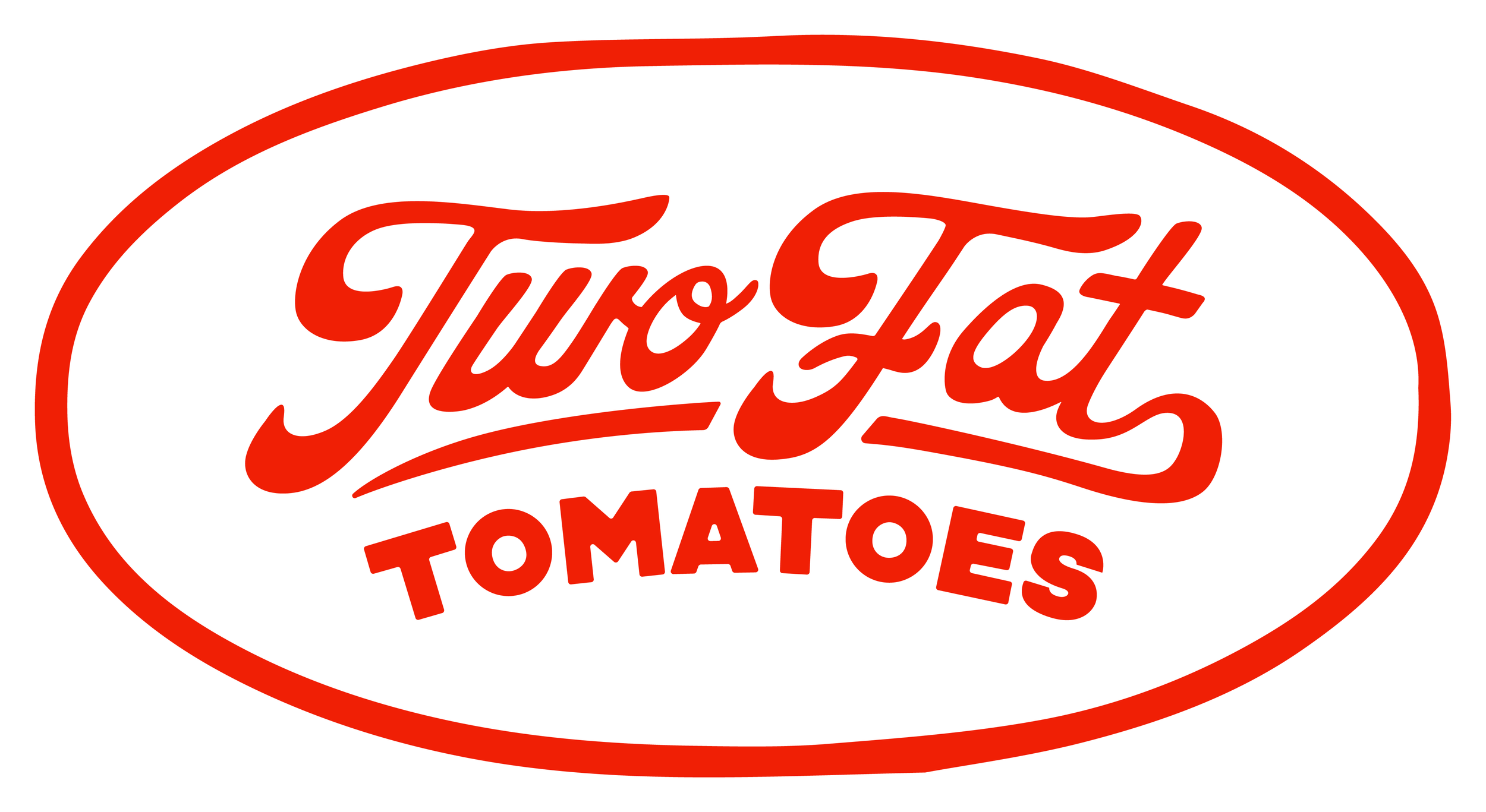
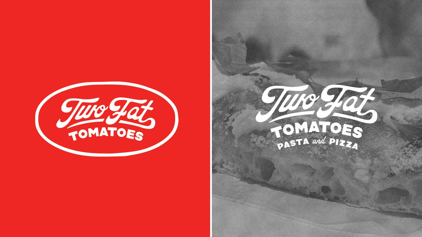
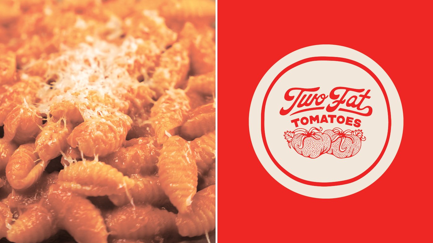
LOGO DESIGN
BRAND IDENTITY
APPAREL DESIGN
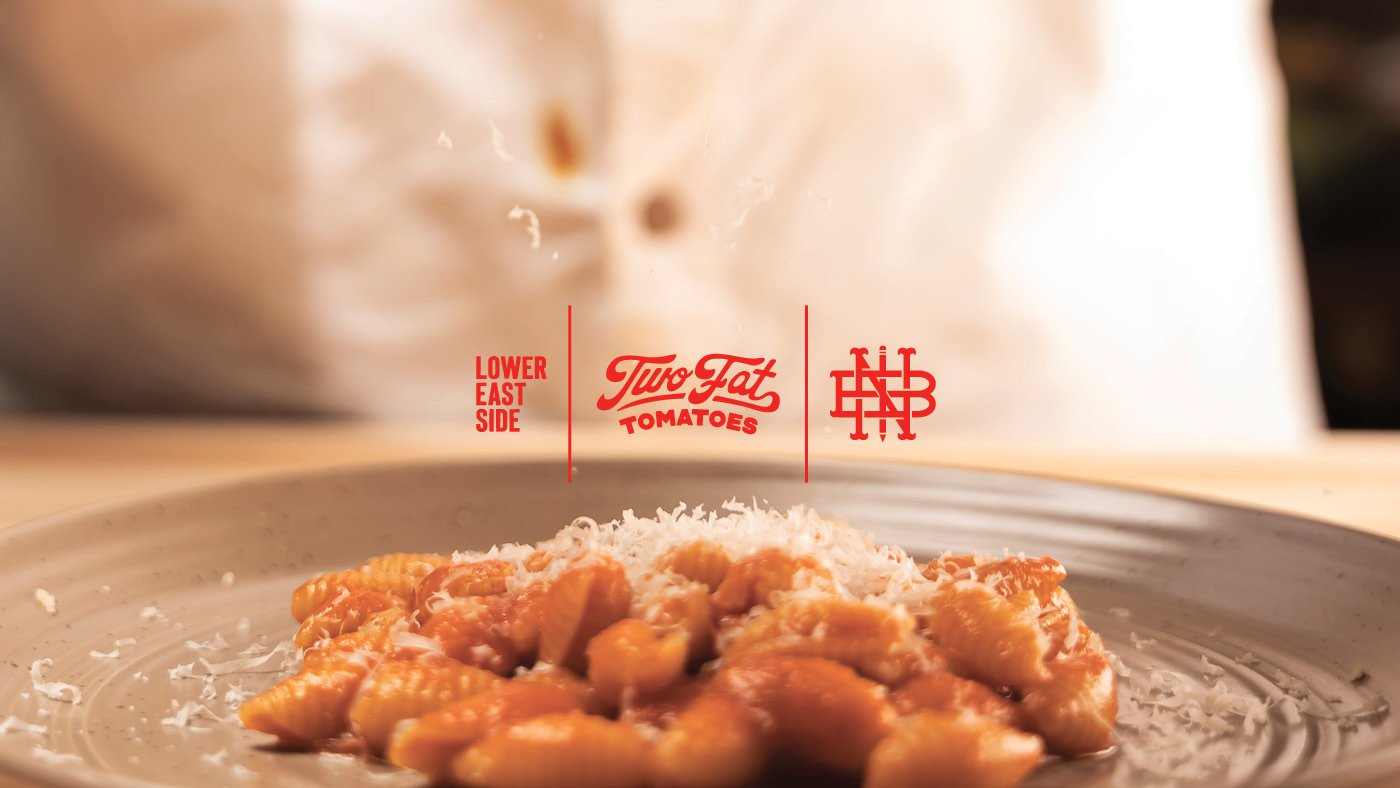
Two Fat Tomatoes is a new pop-up stall from chef Michael Brafman and pastaio Luca Donofrio. Two Fat Tomatoes is a collaboration that resulted from their previous venture, New Amsterdam Pasta Company. The brand evolved because the two shared the same vision of creating a pasta company with uncompromising quality and feverish passion of the Lower East Side. They wanted their brand and menu to expand outside of just pasta, and include pizza and other cuisines that are quintessentially New York. Two Fat Tomatoes has Italian roots, but was aiming to give back the diverse community that it lives within.
A range of designs were created to expand the brand into print, social media and wearable space. The aim was to create a kick-ass brand that reeked of New York City, the Lower East Side and that feeling of eating way too much Pepe e Cacio!

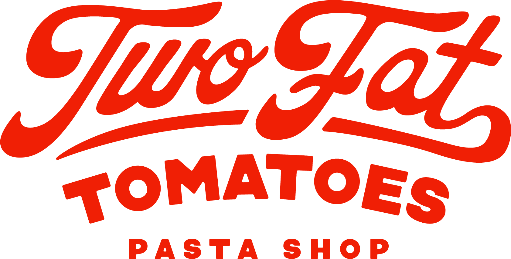
Inspiration was drawn from classic campy pizza box designs we all have seen growing up. There was an opportunity there, to put my own spin on this style and to take advantage of an afterthought and give it the love and creativity it deserved. Hefty, swashing script with bold typography emblematized in a badge — that’s the brand.
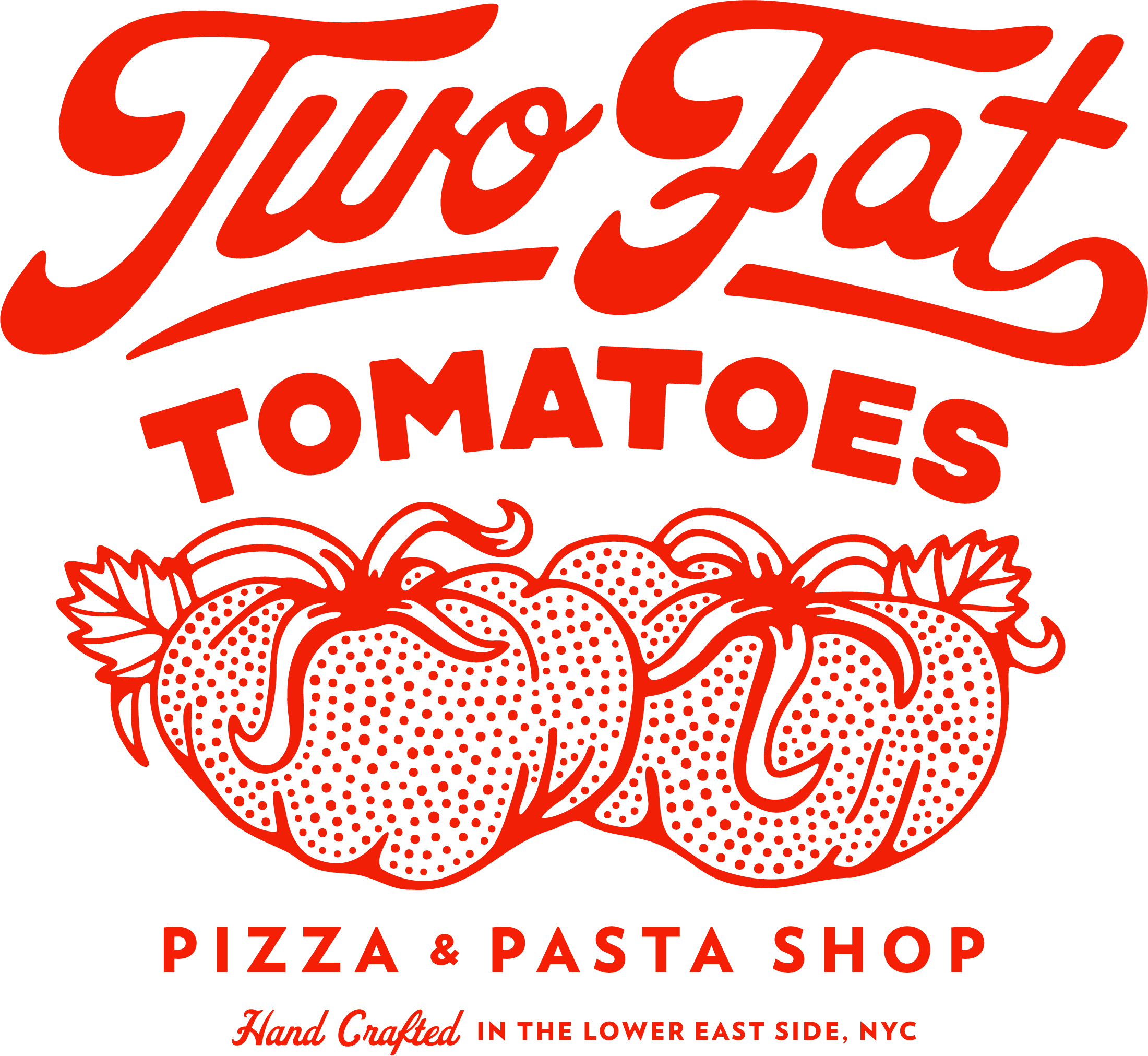
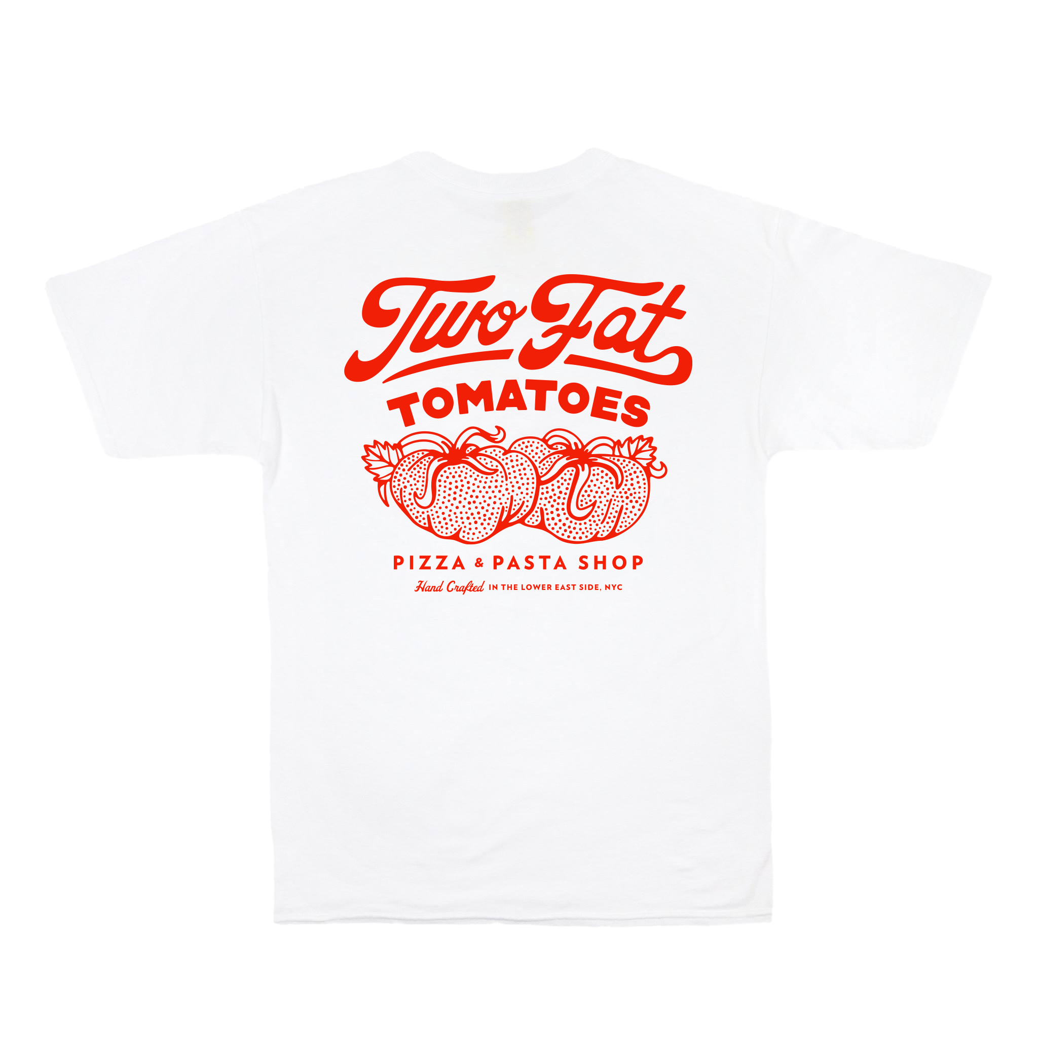

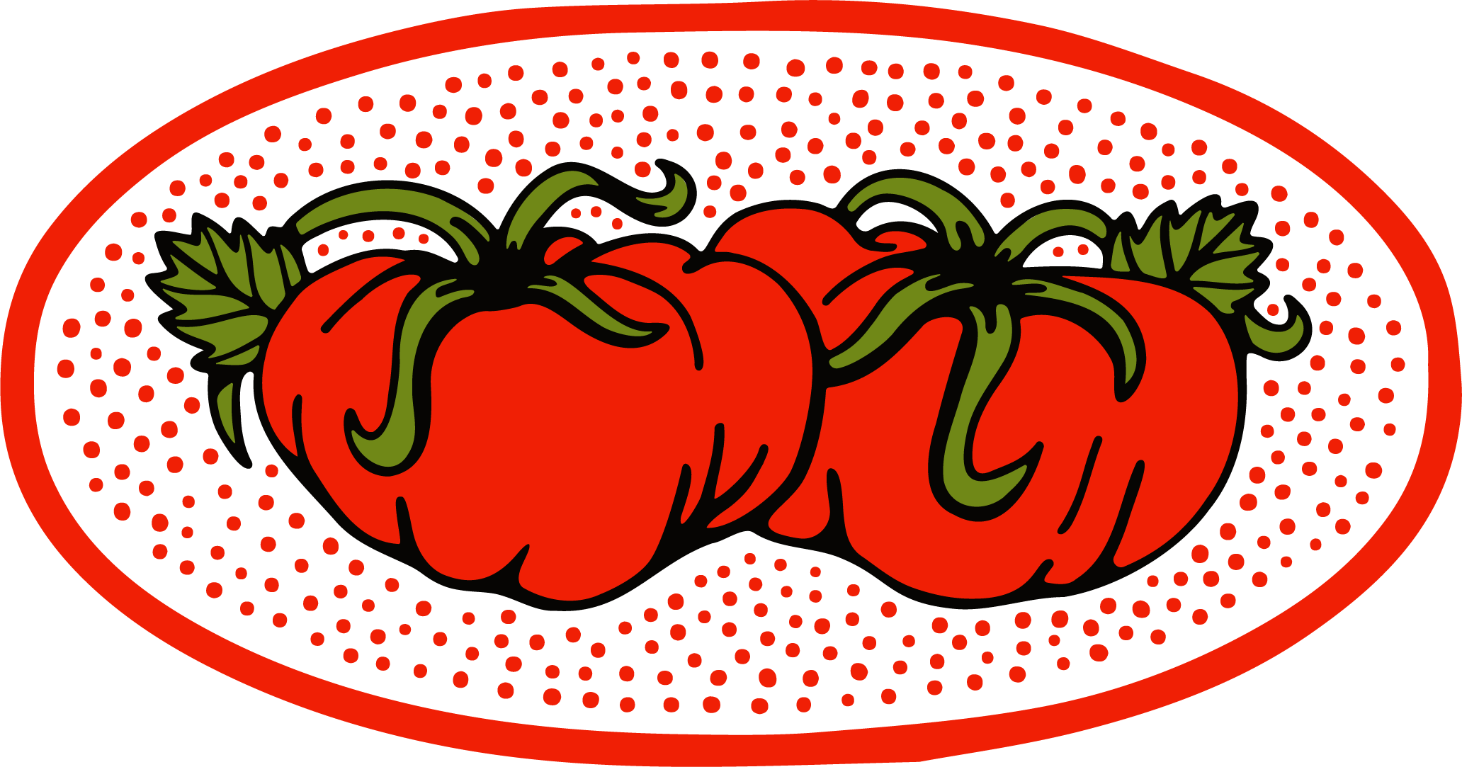
The concept of Two Fat Tomatoes came from the fact that the two owners themselves are light hearted, large fellows who like pasta — think Clemenza from the Godfather. With this idea in mind, the clients wanted a literal illustration of two fat tomatoes to be present in the identity. The tomatoes were supposed to be representative of the two chefs.
While researching, I fell in love with graphic language of tattoos. Bold lines and stippling were provided an interesting twist to create something that was equal parts clean and easy to identify but also ubiquitously New York.